


Project / Butter & Bloom
Role / Lead UX Designer
Date / September 2025
Butter & Bloom
Butter & Bloom
(1) What is Butter & Bloom?
Butter & Bloom is a digital bakery platform designed to make browsing, customising, and ordering baked goods both effortless and enjoyable.
The mobile app was created for a wide range of customers, from busy professionals to families and older users, offering a smooth, accessible experience for everyone. Recognising that many people have specific dietary needs, the app provides filtering options to quickly remove items containing meat, dairy, gluten, or nuts. This allows customers to confidently explore the menu and order products that suit their lifestyle, while enjoying the same sense of warmth and charm as visiting a local bakery in person.
(2) The Problem
Bakery customers often face barriers when trying to order food online, particularly when using existing platforms that prioritise speed over clarity.
Many apps make it difficult to filter by dietary preference, leaving users unsure if a product truly meets their requirements. This uncertainty can result in hesitation, wasted time, and sometimes abandoned orders. In addition, cluttered menus, inconsistent labelling, and confusing navigation create unnecessary friction, especially for those who are not as tech-savvy. Families looking to place large orders, or individuals with accessibility needs, often find the process time-consuming and frustrating. These issues highlight the need for a solution that is both inclusive and easy to use.
(3) The Goal
The aim of Butter & Bloom is to provide a simple, inclusive, and visually clear bakery ordering experience that reflects the warmth of a local shop.
The app seeks to empower customers by offering dietary filters, customisable pre-ordering, and a seamless checkout process that reduces hesitation and builds confidence. By focusing on clarity and personalisation, the platform ensures that every user can quickly discover products that suit their needs. It also simplifies bulk orders for families and improves accessibility for older users with clear labels, readable text, and straightforward navigation. In doing so, Butter & Bloom positions itself not only as a bakery app, but as a digital experience that makes everyday indulgence more thoughtful and accessible.

Understanding the user

(4) User Surveys
To gain insights into customer behaviour and expectations, I conducted short surveys with a mix of bakery customers, including young professionals, parents, and retirees. The survey focused on ordering habits, frustrations with existing apps, and features that would improve the bakery experience.

The surveys revealed that customers value clarity, simplicity, and flexibility above all when ordering from a bakery app. Clear labelling and dietary filters for vegan, gluten-free, and nut-free options are seen as essential, while cluttered menus and lengthy checkout processes often lead to frustration or even abandoned orders. Participants also highlighted the importance of personalisation, such as the ability to favourite items, place custom pre-orders, and quickly reorder past purchases. Delivery speed and pickup flexibility were considered critical, with users expecting accurate timings and real-time tracking to fit into their daily routines. Finally, accessibility emerged as a key consideration, with larger text, readable icons, and smooth navigation making the app more inclusive and boosting confidence for older users.
(5) Pain Points
Through surveys, interviews, and usability testing, several recurring challenges were identified in how customers interact with bakery apps.
While users appreciated the convenience of digital ordering, they also encountered moments of frustration that disrupted the overall experience. These issues centred around dietary filtering, clarity of product presentation, and the checkout process, all of which directly influenced confidence and ease of use.
Filtering
Users with dietary needs (vegan, gluten-free, nut-free) struggle to filter out items quickly, leading to frustration and wasted time.
Clarity
Product menus feel overwhelming, with too much scrolling and not enough clear categorisation or imagery.
Checkout
Users find checkout too long or confusing, which increases the chance of cart abandonment.
(6) User personas
Based on the findings from user surveys and interviews, four key personas were developed to represent the bakery app’s target audience.
These personas capture the needs, goals, and frustrations of different customer types, ensuring the design decisions remain user-focused and inclusive.


(7) User Journey
To better understand how each persona interacts with the bakery app, I mapped out user journeys that capture their goals, actions, emotions, and challenges.
These journeys highlight the steps users take when ordering and reveal opportunities for design improvements that address their specific needs.


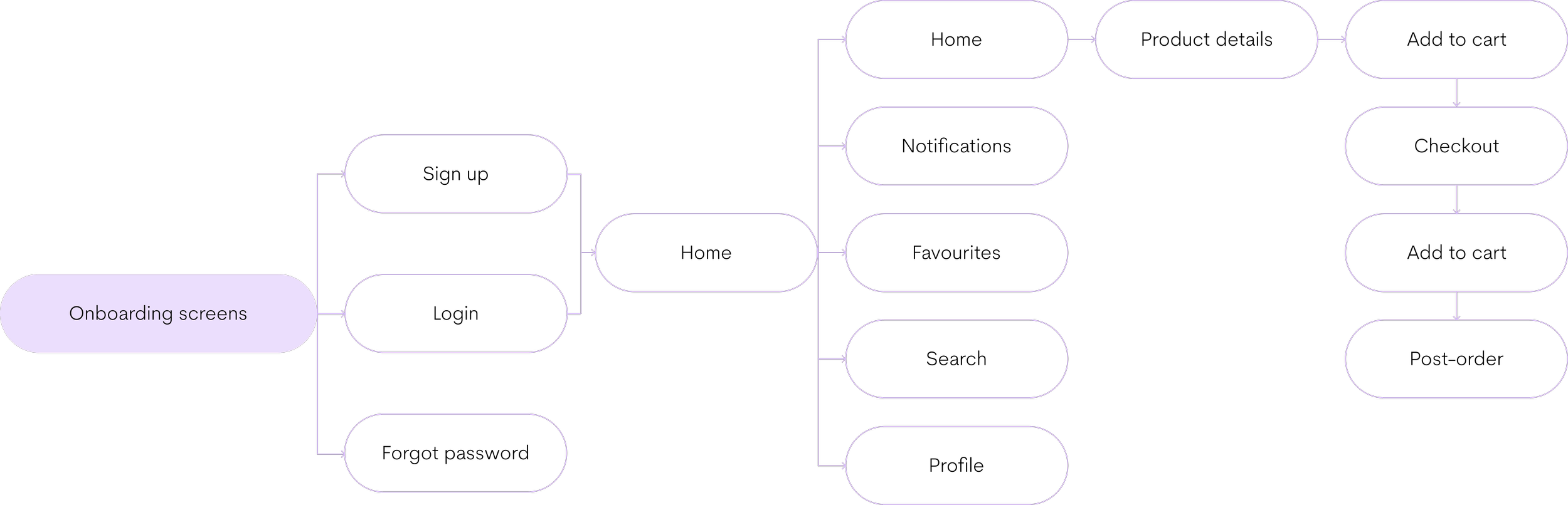
(8) User Flow
After defining the user personas and mapping their journeys, I created a universal user flow to capture the ideal path through the app.
The flow illustrates how customers move from onboarding and sign-in, to browsing and selecting items, through to checkout, confirmation, and post-order features. This step translates research insights into a streamlined structure, ensuring the app supports clarity, simplicity, and efficiency for all types of users.
Design process

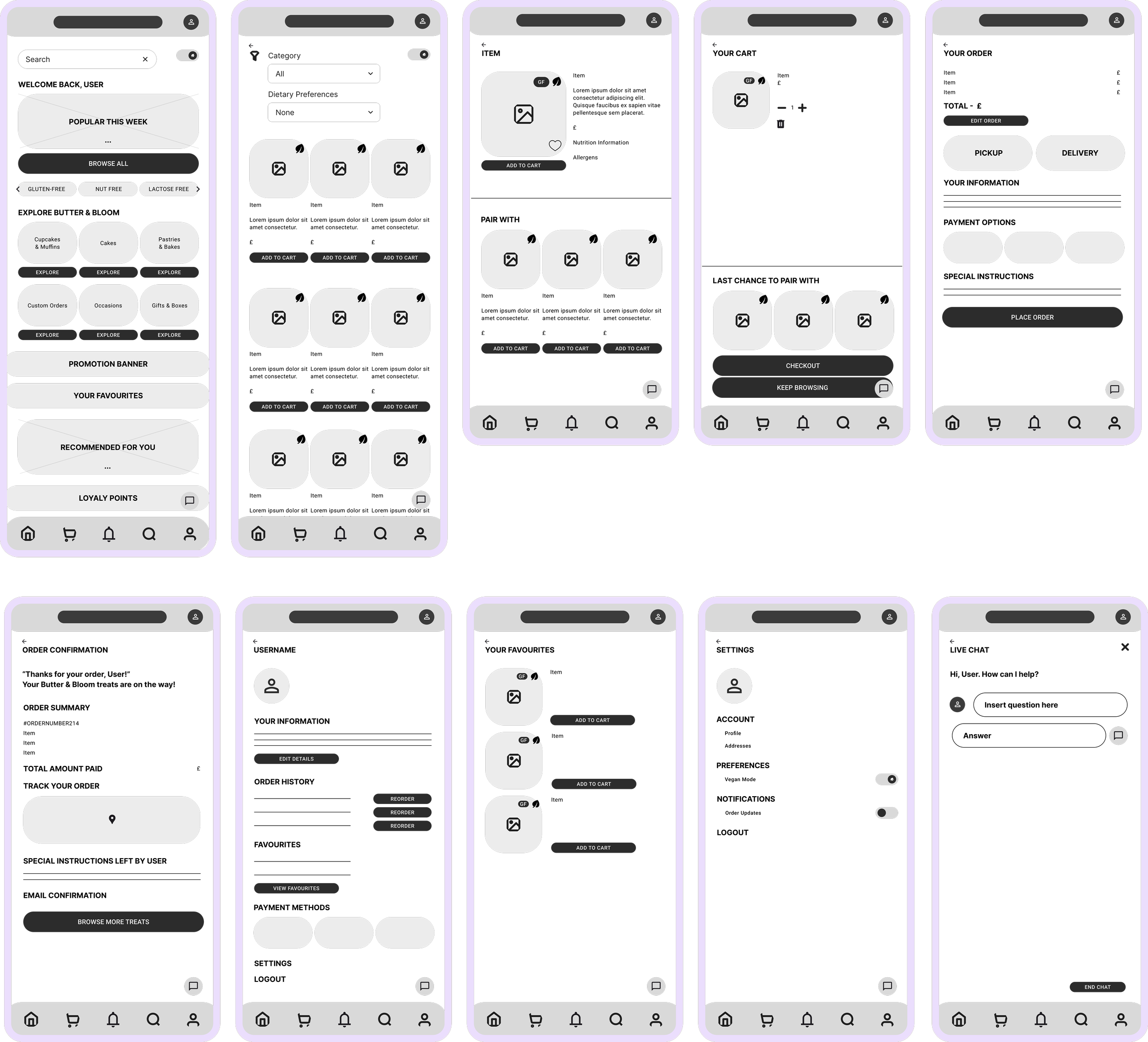
(9) Usability study findings
To evaluate the usability of the bakery app, I conducted a test with five participants. They were asked to complete a series of tasks, including browsing categories, favouriting items, purchasing an item, and toggling dietary filters. After each task, they provided feedback on ease of use and suggested improvements. Overall, participants found the app intuitive and easy to navigate, but highlighted a few areas for refinement.
Category labelling
During testing, a few participants mentioned that the word “categories” was not the most intuitive way to describe product groupings. While they were able to complete the task easily, the terminology felt slightly unclear and could cause hesitation for first-time users. Updating this label to something more descriptive, such as “Bakery Sections” or “Shop by Type”, would make navigation more self-explanatory and reduce any potential friction.
Dietary & Vegan Mode Toggle
The dietary filter, represented by a plant emoji, was identified by participants.They noted that vegan items were not clearly marked within the product listings. This lack of clarity could create confusion and reduce confidence for users with dietary restrictions. Improving toggle responsiveness and adding a visible “Vegan” label next to products would enhance accessibility and trust.
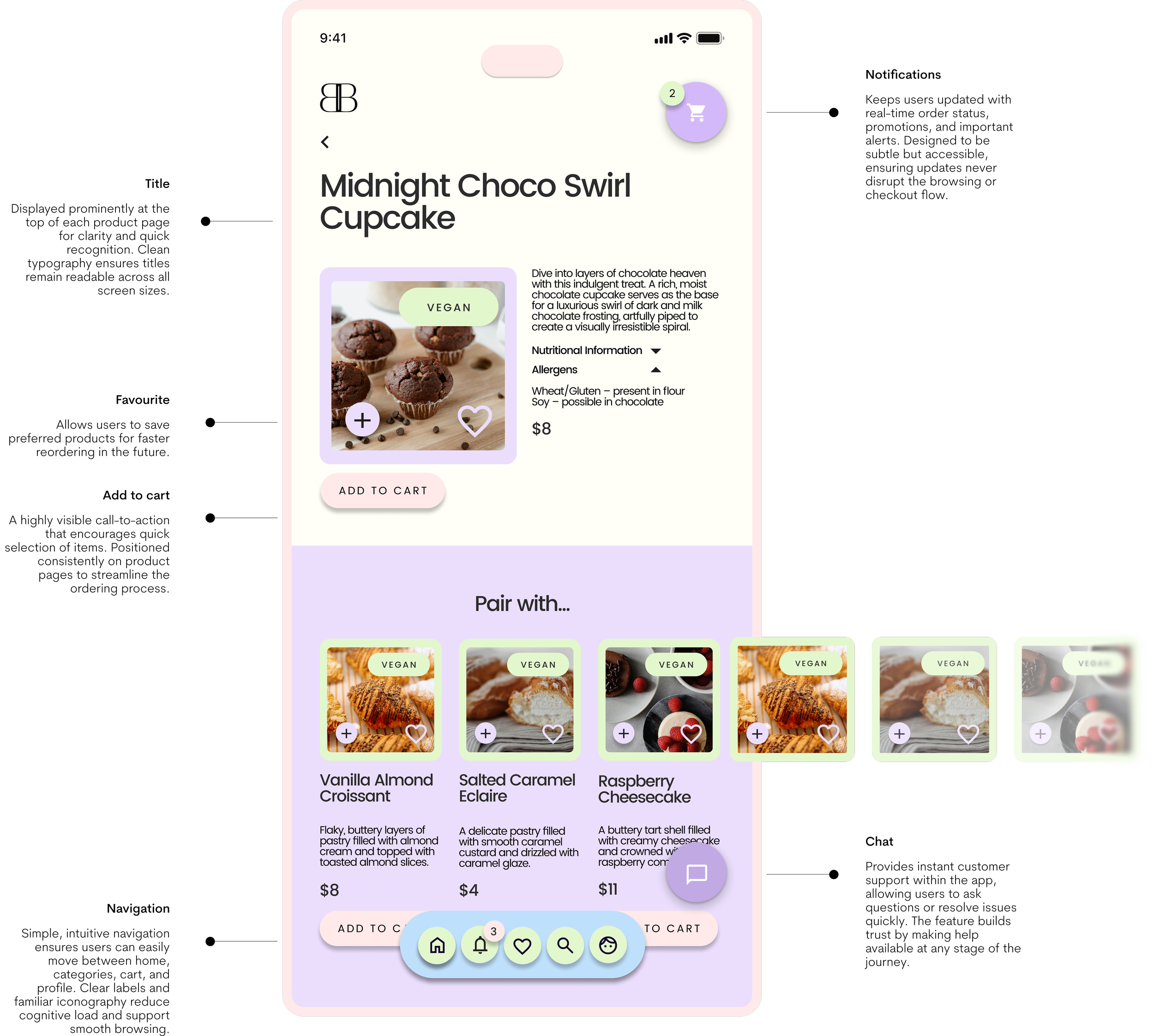
Icon Placement – Notifications and Cart
One issue highlighted during testing was the placement of the notifications and cart icons. Participants felt that their positions were unintuitive, with the cart icon not being as immediately accessible as expected. Since users interact with the cart more frequently than notifications, swapping their positions would improve usability. Placing the cart in a more prominent, familiar location (such as the top-right corner) will ensure quicker access during the ordering process, while notifications can take a secondary position.
Refining the Design


Butter &
Bloom
(9) Accessibility
In designing the bakery app, accessibility was a core focus to ensure that the platform could be used comfortably by a wide range of customers, including those with visual, motor, or cognitive challenges. While the app already performed well in usability testing, several refinements were identified to make the experience more inclusive, intuitive, and aligned with accessibility best practices.
Text Size and Readability
Accessibility testing revealed the importance of ensuring that text is large enough and easy to read, particularly for older users. Consistent use of legible fonts, adequate contrast between text and background, and scalable text options would support users with visual impairments or those browsing on smaller screens.
Clear Labelling and Icons
Relying on icons alone can create confusion, especially for users unfamiliar with certain symbols (e.g., a plant emoji for vegan items). Adding explicit text labels alongside icons improves clarity and ensures that dietary filters, categories, and actions are understandable for all users, regardless of their familiarity with iconography.
Smooth Navigation and Tap Targets
Participants noted moments of friction when navigating between screens. For accessibility, it’s essential that buttons and interactive elements are large enough to tap comfortably, with sufficient spacing to prevent errors. Streamlined navigation with consistent interaction patterns supports users with motor impairments or those using assistive devices.

Going Forward

(10) Key takeaways
The usability study and design process highlighted several important lessons that shaped the development of the bakery app. These insights not only addressed immediate usability concerns but also informed broader design decisions for future iterations.
Clear labelling, consistent icon use, and straightforward navigation help reduce hesitation, enabling users to complete tasks quickly and with confidence. At the same time, features such as dietary filters and customisable options make the app feel inclusive and accessible, ensuring it meets the diverse needs of everyday customers.
(11) Next steps
Following the usability testing and design refinements, the next phase will focus on further improving the app experience and preparing for launch.
The next steps involve continuing to develop inclusive features by implementing adjustable text sizes, ensuring strong colour contrast, and refining tap targets for ease of use across all devices. Alongside these improvements, expanding functionality with options such as saved favourites, loyalty rewards, and subscription services will enhance user engagement and encourage repeat purchases.